


By using Curves, I was able to adjust the lighting of the picture. As you can see the Mid and Light tones are on the light side, as I wanted to make her more brighter.


 With this image, I used the Selective Colour Options and adjusted with the Red. This is because i wanted to make her look sharper, visible and vibrant. If you look at the original picture, she looks rather a bit out of colour or saturated. I adjusted each colour to give her the best look as possible and enhance the colour.
 For this Image, i wanted to create a vintage effect. I used the Photo Filter, and chose the Sepia, which gave it a light-brown, old effect. I increaesed the Density to increase the effect of the Sepia
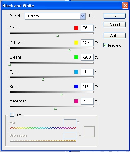
For this effect, I wanted to make it black and white so I used the Black and White effect. I noticed that you can manipulate the black and white effect and change the colour of it. This is another way you can make a Sepia look, or change the colour in general. Is probably the most easiest way to get the right tone or colour you want.


