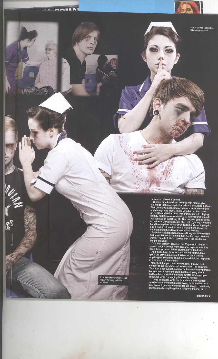
Kerrang, by the looks of it is a rock/metal magazine, according to the house styles, theme/colours and the pictures used. The issues/articles likely to be inside the magazine are possibly an interview featuring the band (Central Image). The target audience for this magazine are people who enjoy Metal/Rock magazines , the particular age group is aimed for teenagers 18 and above due to its gothic and rather semi-violent theme. They’re interests are likely to be rock concerts, a Metallica. They are using a direct mode of address as they are looking directly at the reader; the relationship they’re looking for is rather unusual, it’s obvious they are using a direct mode of address because the band leader (The one at the middle) is putting his finger on his lips, telling him/her to be quiet. They are probably trying to tell the reader ‘Shhh, We killed someone.’ The front cover is a band called ‘BRING ME THE HORIZON’ they are used, to be in the front cover of the magazine because, their style and type of music relates to the type of magazine, and the fact they all look rather gothic and terrifying which suits the magazine itself. The Anchorage text is REIGN IN BLOOD, RISE AGAIN. This tells us that the artist is more hardcore and it gives the sense of power and domination. When it said Rise Again, it probably means that they returned or came back once again. The overall message the artist is trying to say is probably that they are more intense, better and a lot more eye-catching than they we’re before, probably something happened in the past that may decrease their reputation with the music industry.
The title block tell us that the magazine may consist of violence, as you can see that the Title Block is cracking, as if a rock is thrown at it. The title of the magazine tells us the readers enjoy reading about Rock/Metal. Moreover the title of the magazine tells us that the imagery and style will relate to rock (It looks as if it is breaking by the loud volume), it will have a rather rough background.
The puffs (which are located at the bottom of the magazine) implies that, there are a lot of rock artists that will be featured inside the magazine, it tells us that the magazine will expect fans from that specific genre or general fans of those bands. The slogan says ‘Chemical Romance back in business’, which again tells the user that another band will be featured as well, additionally it means that Chemical Romance are featuring their new releases of their song. It helps attract the readers because My Chemical Romance is a famous and well-known rock band throughout the US and UK, this will benefit the magazine as it will get more fan readers. The colours used are mainly black, red and white. They used these three colours as it’s eerie, dark and bloody which relates to how rock is like. The colours do appeal to me, as rock is all about insanity and darkness. Furthermore the fonts are bold and big; it is trying to represent domination and overpowering other music genres.
The strategies that the magazine used to appeal and capture audiences/fans attention is by featuring famous bands and rock stars like My Chemical Romance and Ozzy Osbourne. They also added buzz words like ‘EXCLUSIVE’ which is alluring as it is only available for this music magazine. Furthermore they have added a lot of big and bold fonts, as well as warm colours (RED) as it will captures the audience’s attention.

The magazine uses a lot of imagery to convey messages and give the user a vague idea of what the magazine will be featuring and what it will be about. As you can see the pictures are constructed and positioned around the page to make it look like there is a lot of featured articles and news that will be informed to the user in the magazine. At the top of the page, Ozzy Osbourne is the main image because it’s big and the first image that captures the reader’s attention. Moreover they used Ozzy Osbourne because he’s an extremely popular Rock Star and the fact that maybe he will be featured too in the magazine. Additionally they also have other images that have a small introductory/news to explain what is to expect within the magazine. At the bottom right corner, they have pictures of the same magazine to promote it and persuade the reader to purchase their magazine more in the future. These support my initial findings because the type of imagery used relates to the audience that reads the type of magazine, which is the rock/metal genre. The colours used are mainly black and white (They also have unnecessary colour like red and yellow, but this makes it a bit more vibrant in a way, as rock is suppose to be fun and enjoyable). The whole contents page is rather de-saturated, especially the top picture which probably represents how old Ozzy Osbourne is, and still standing and a legend. The fonts are Bold and Big, and it looks ragged and rough to convey how Rock is ‘Rough’ music genre. On the other hand, it captures the audience’s attention, as the magazine wants you to notice it, so they’ll be able to inform you easily of what is being featured in the magazine. It of course supports the style of the front cover, because it is not misleading the audience into something else, and it’s still keeping the rock and metal sense in the magazine. The contents page is separated with subheadings and images, beneath these, they have the page numbers, and the names of bands/artist and titles informing the reader what is upcoming. This makes it accessible for the reader doesn’t have to always look around for information; instead they look at this section for what they should expect. In this contents page it is split up into a proper and understandable sections. At the bottom you have the columns of information and subheadings to help the user become aware of the things that will come up the magazine. They have 1 promotional feature which is located at the bottom of the contents page; it is a ‘LIVE AND LOUD’ poster. This will enhance the magazine’s popularity as well as promoting their magazines and the specified artists included in the promotional feature. The logo is placed in the middle of the contents page; it isn’t as dominant as the top picture as it is much bigger and capturing. They have one other franchise, as you look at the bottom right corner of the contents page, you can see that they are advertising their magazine, giving promotional offers. It is saying ‘Get K! Delivered to your door, for £6 every month’, this is promoting their magazine on the contents page.